Redemption experience
2021-2011
I did all the product design, including wireframes, prototypes and handoff. Collaborated with the product owner, stakeholders and frontend developers.
I redesigned the redemption experience for the Morot & Co giftcards. The aim was to create a fun experience around the task of choosing a gift. The previous experience had developed from a MVP and this time we decided to have an MLP mindset instead.
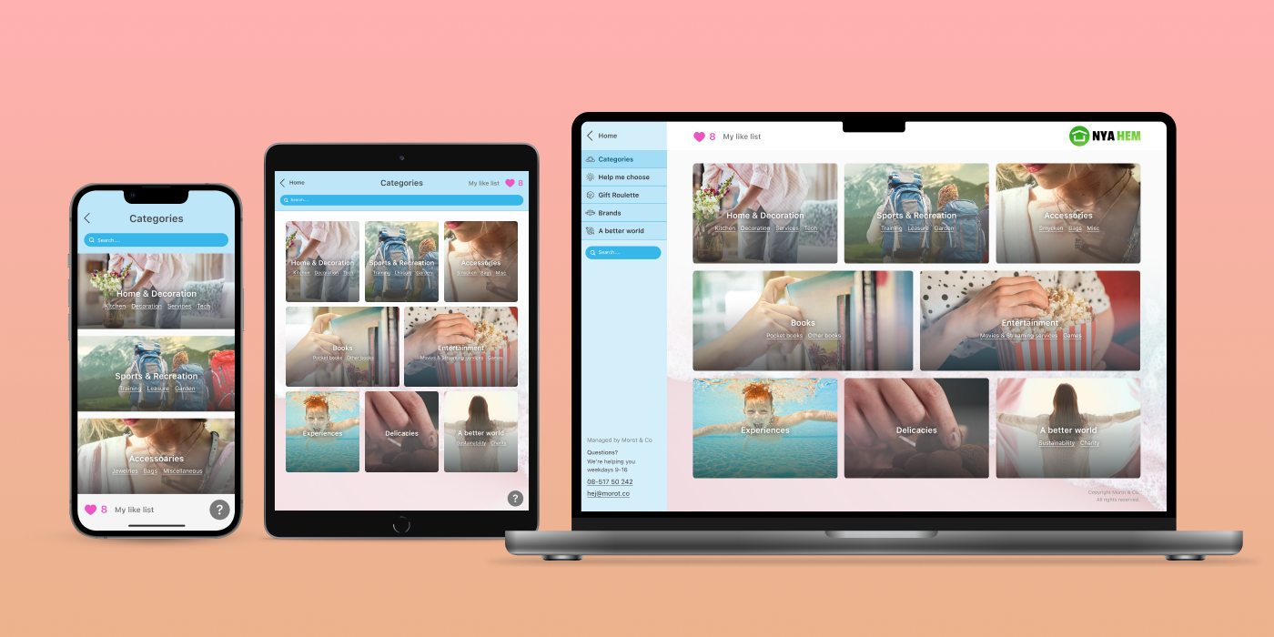
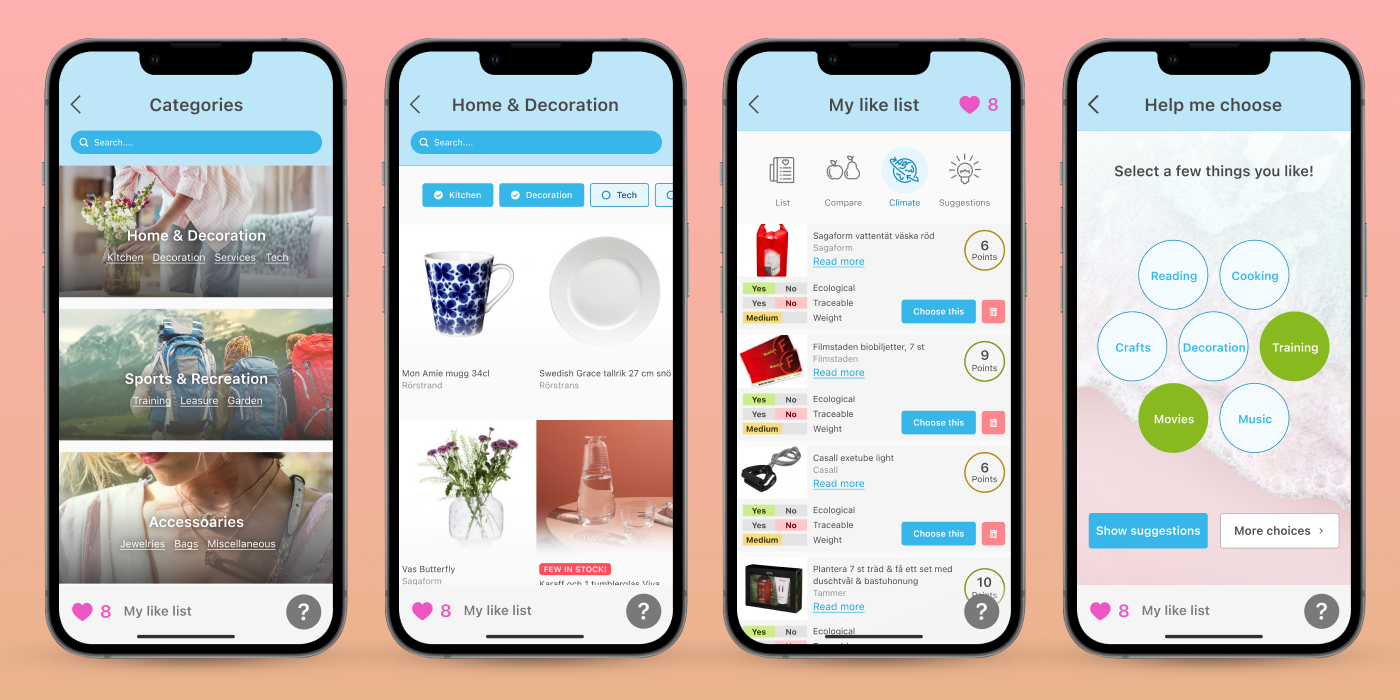
The solution was to create several paths to explore the selection, adding a like list with multiple filters and an app-inspired UI.
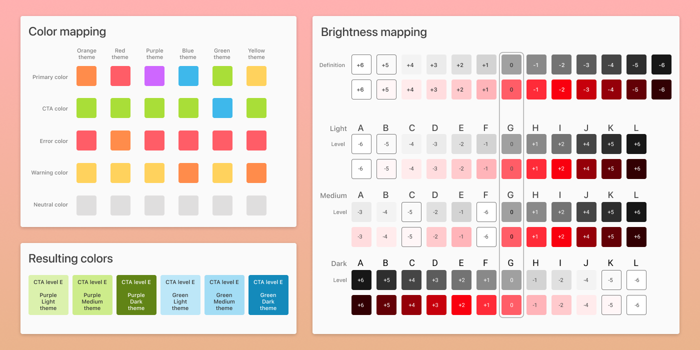
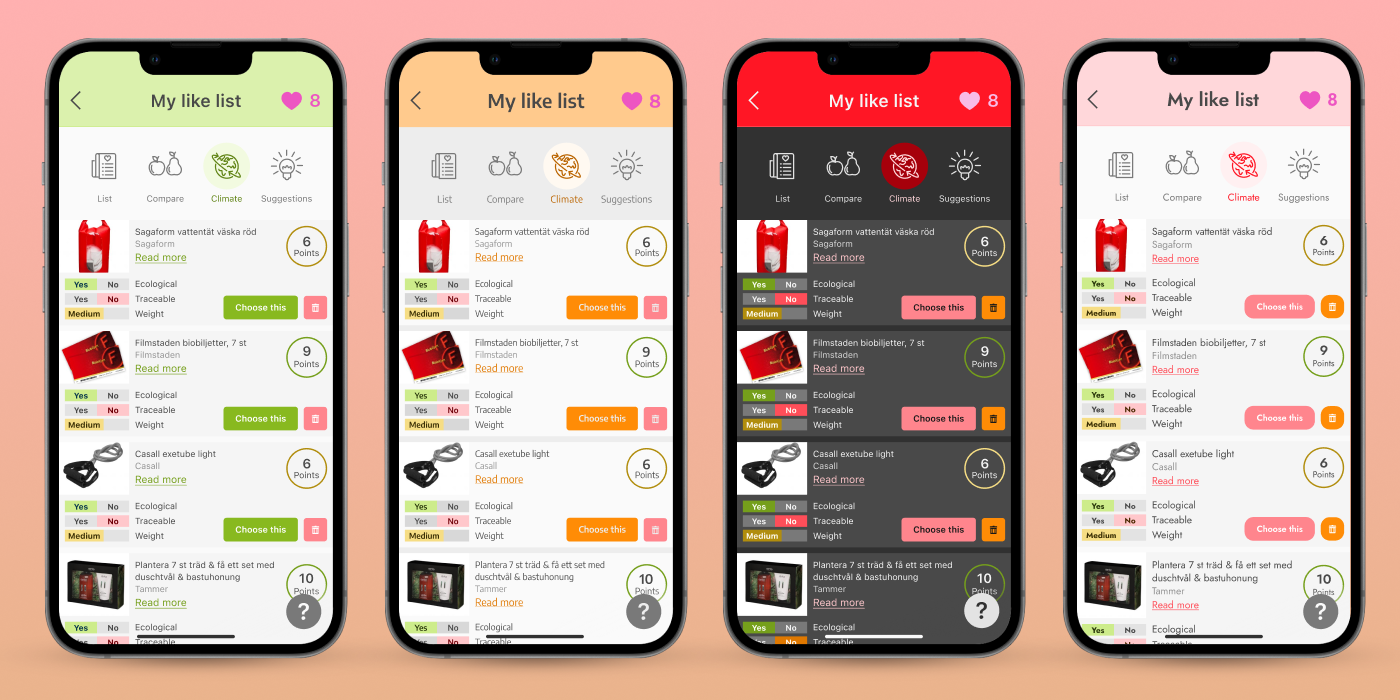
One of the unique features of the redemption service is that it may be customized visually. Properties like color, fonts and corner radius may be adjusted to fit the visual identity of the customer.
The goal is to make it so easy to costomize that it becomes “custom by default”. This required quite a complex design system, especially when it comes to the colors.
Depending on the chosen primary color, an automatic choice of secondary colors will be made to ensure good contrast in all cases. It is also possible to choose the brightness of the theme. This is done by having a character represent the color, which in turn is a reference to a level of brightness depending on the chosen setting.
To work with this intricate color system, I had to write a custom plug-in for Figma.
The users often wants to think trough their choice of gift. A common behaviour is to first log in at one device, then continue later somewhere else.
The like list is saved so that the user may easily continue the exploration next time. A lot of effort has been put into making sure the experience is equally great on all devices.